
| 일 | 월 | 화 | 수 | 목 | 금 | 토 |
|---|---|---|---|---|---|---|
| 1 | 2 | 3 | 4 | 5 | 6 | |
| 7 | 8 | 9 | 10 | 11 | 12 | 13 |
| 14 | 15 | 16 | 17 | 18 | 19 | 20 |
| 21 | 22 | 23 | 24 | 25 | 26 | 27 |
| 28 | 29 | 30 | 31 |
- Rxjava Observable
- jvm이란
- 안드로이드 라이선스 종류
- 스택 자바 코드
- 객체
- ar vr 차이
- 플러터 설치 2022
- 안드로이드 유닛 테스트
- rxjava disposable
- 서비스 쓰레드 차이
- android retrofit login
- 2022 플러터 안드로이드 스튜디오
- ANR이란
- 클래스
- 서비스 vs 쓰레드
- 안드로이드 os 구조
- 2022 플러터 설치
- jvm 작동 원리
- 안드로이드 레트로핏 사용법
- 안드로이드 레트로핏 crud
- 스택 큐 차이
- rxjava hot observable
- android ar 개발
- 큐 자바 코드
- 자바 다형성
- 멤버변수
- 안드로이드 유닛 테스트 예시
- 안드로이드 유닛테스트란
- rxjava cold observable
- 안드로이드 라이선스
- Today
- Total
나만을 위한 블로그
[Android Compose] Text 사용법 본문
이 포스팅에선 Compose의 Text에서 사용할 수 있는 옵션들을 확인한다.
먼저 Text의 구현은 이렇다.
@Composable
fun Text(
    text: AnnotatedString,
    modifier: Modifier = Modifier,
    color: Color = Color.Unspecified,
    fontSize: TextUnit = TextUnit.Unspecified,
    fontStyle: FontStyle? = null,
    fontWeight: FontWeight? = null,
    fontFamily: FontFamily? = null,
    letterSpacing: TextUnit = TextUnit.Unspecified,
    textDecoration: TextDecoration? = null,
    textAlign: TextAlign? = null,
    lineHeight: TextUnit = TextUnit.Unspecified,
    overflow: TextOverflow = TextOverflow.Clip,
    softWrap: Boolean = true,
    maxLines: Int = Int.MAX_VALUE,
    minLines: Int = 1,
    inlineContent: Map<String, InlineTextContent> = mapOf(),
    onTextLayout: (TextLayoutResult) -> Unit = {},
    style: TextStyle = LocalTextStyle.current
): Unit
디벨로퍼는 아래를 참고한다.
androidx.compose.material | API reference | Android Developers
androidx.appsearch.builtintypes.properties
developer.android.com
고급 요소로 텍스트를 표시하고 정보를 제공한다. 기본 스타일은 MaterialTheme / 컴포넌트에서 제공하는 LocalTextStyle을 사용한다. 자체 스타일을 사용하는 경우 먼저 LocalTextStyle을 가져오고 TextStyle.copy를 써서 테마에서 정의된 속성을 유지하고 바꾸려는 특정 속성만 변경하는 게 좋다
사용 편의를 위해 TextStyle에서 자주 쓰이는 매개변수도 여기서 제공된다. 우선순위 순서는 아래와 같다
- 매개변수가 명시적으로 설정돼 있다면(null이 아니거나 TextUnit.Unspecified가 아닌 경우) 이 매개변수가 항상 사용됨
- 매개변수가 설정되지 않았다면(null이거나 TextUnit.Unspecified인 경우) 해당 매개변수의 값은 스타일에서 가져온다
색의 경우 색이 설정되지 않았고 스타일에도 색이 없으면 LocalContentColor가 LocalContentAlpha 값과 같이 쓰인다. 이는 이 Text 또는 Text를 포함하는 요소가 다양한 배경색에 적응하면서도 대비, 접근성을 유지할 수 있게 한다
테마의 스타일을 적용한 링크가 포함된 Text 예시는 아래를 참고한다
import androidx.compose.material.Text
import androidx.compose.ui.text.LinkAnnotation
import androidx.compose.ui.text.buildAnnotatedString
import androidx.compose.ui.text.withLink

val url = "https://developer.android.com/jetpack/compose"
val annotatedString = buildAnnotatedString {
    append("Build better apps faster with ")
    // If the annotation's TextLinkStyles is null,
    // then the link style defaults to Material styling.
    withLink(LinkAnnotation.Url(url = url)) { append("Jetpack Compose") }
}
Text(annotatedString)
테스트를 위한 컴포즈 메인 액티비티는 아래처럼 설정했다.
import android.os.Bundle
import androidx.activity.ComponentActivity
import androidx.activity.compose.setContent
import androidx.activity.enableEdgeToEdge
import androidx.compose.foundation.layout.Arrangement
import androidx.compose.foundation.layout.Column
import androidx.compose.foundation.layout.PaddingValues
import androidx.compose.foundation.layout.fillMaxSize
import androidx.compose.foundation.layout.padding
import androidx.compose.material3.Scaffold
import androidx.compose.material3.Text
import androidx.compose.runtime.Composable
import androidx.compose.ui.Alignment
import androidx.compose.ui.Modifier
import androidx.compose.ui.tooling.preview.Preview
import com.example.composepractice.ui.theme.ComposePracticeTheme
import dagger.hilt.android.AndroidEntryPoint

@AndroidEntryPoint
class MainActivity : ComponentActivity() {

    override fun onCreate(savedInstanceState: Bundle?) {
        super.onCreate(savedInstanceState)
        enableEdgeToEdge()
        setContent {
            ComposePracticeTheme {
                Scaffold(modifier = Modifier.fillMaxSize()) { innerPadding ->
                    TextTest(innerPadding, text = "Hello, World!")
                }
            }
        }
    }
}

@Composable
fun TextTest(
    innerPadding: PaddingValues,
    text: String
) {
    Column(
        modifier = Modifier.fillMaxSize()
            .padding(innerPadding),
        horizontalAlignment = Alignment.CenterHorizontally,
        verticalArrangement = Arrangement.Center
    ) {
        Text(text)
    }
}
Text에 글자를 표시하려면 간단하게 Text안에 문자열을 추가하면 된다.
TextTest()의 Column 안에 있는 Text는 문자열 매개변수를 받아서 그대로 표시하는데, Hello World!를 넘겼기 때문에 그대로 표시된다.
strings.xml에 있는 문자열을 표시하려면 R.string.hello_world를 Text() 안에서 호출하면 된다. 그러나 그냥 쓸 수 있는 건 아니고 stringResource()에 넣어서 호출해야 한다.
import android.os.Bundle
import androidx.activity.ComponentActivity
import androidx.activity.compose.setContent
import androidx.activity.enableEdgeToEdge
import androidx.compose.foundation.layout.Arrangement
import androidx.compose.foundation.layout.Column
import androidx.compose.foundation.layout.PaddingValues
import androidx.compose.foundation.layout.fillMaxSize
import androidx.compose.foundation.layout.padding
import androidx.compose.material3.Scaffold
import androidx.compose.material3.Text
import androidx.compose.runtime.Composable
import androidx.compose.ui.Alignment
import androidx.compose.ui.Modifier
import androidx.compose.ui.res.stringResource
import androidx.compose.ui.tooling.preview.Preview
import com.example.composepractice.ui.theme.ComposePracticeTheme
import dagger.hilt.android.AndroidEntryPoint

@AndroidEntryPoint
class MainActivity : ComponentActivity() {

    override fun onCreate(savedInstanceState: Bundle?) {
        super.onCreate(savedInstanceState)
        enableEdgeToEdge()
        setContent {
            ComposePracticeTheme {
                Scaffold(modifier = Modifier.fillMaxSize()) { innerPadding ->
                    TextTest(innerPadding, text = stringResource(R.string.hello_world))
                }
            }
        }
    }
}

@Composable
fun TextTest(
    innerPadding: PaddingValues,
    text: String
) {
    Column(
        modifier = Modifier.fillMaxSize()
            .padding(innerPadding),
        horizontalAlignment = Alignment.CenterHorizontally,
        verticalArrangement = Arrangement.Center
    ) {
        Text(text)
    }
}
stringResource()의 구현은 아래와 같다.
/**
 * Load a string resource.
 *
 * @param id the resource identifier
 * @return the string data associated with the resource
 */
@Composable
@ReadOnlyComposable
fun stringResource(@StringRes id: Int): String {
    val resources = resources()
    return resources.getString(id)
}
이것을 사용하는 이유는 컴파일 / 런타임 시점의 차이와 관련 있다. R.string.hello_world를 로그로 확인하면 2131558446 같은 정수 ID가 표시되는데, 실제 문자열 리소스가 아닌 그 리소스를 참조하는 정수를 가져오기 때문에 Text에선 사용할 수 없다.
그래서 내부적으로 Context를 통해 Resources 객체를 가져온 다음 resources.getString()의 매개변수로 R.string.hello_world의 ID를 넘겨서 실제 문자열로 변환 후 리턴하는 stringResource()를 써야 한다. resources()의 내부 구현은 아래와 같다.
/**
 * A composable function that returns the [Resources]. It will be recomposed when [Configuration]
 * gets updated.
 */
@Composable
@ReadOnlyComposable
internal fun resources(): Resources {
    LocalConfiguration.current
    return LocalContext.current.resources
}
결과적으로 해당 컴포저블 함수가 호출되는 곳의 Context를 통해 getString()으로 문자열을 로딩해 사용하는 방식이란 걸 알 수 있다.
레거시 뷰 시스템의 Context.getString()에 대응하는 함수로 이걸 통해 어떤 컴포저블 함수에서든 strings.xml의 문자열 리소스 ID를 가져와서 그 ID에 매핑된 텍스트를 쓸 수 있다.
Text에 표시되는 텍스트에 스타일을 지정할 수도 있다. 글자색만 바꾼다면 아래처럼 할 수 있다.
@Composable
fun TextTest(
    innerPadding: PaddingValues,
    text: String
) {
    Column(
        modifier = Modifier.fillMaxSize()
            .padding(innerPadding),
        horizontalAlignment = Alignment.CenterHorizontally,
        verticalArrangement = Arrangement.Center
    ) {
        Text(
            text = text,
            color = Color.Blue
        )
    }
}
글자 크기를 변경하려면 아래처럼 한다. 컴포즈에선 글자 크기에 dp를 쓰지 않고 sp를 사용한다는 것에 주의한다.
import androidx.compose.ui.unit.sp

@Composable
fun TextTest(
    innerPadding: PaddingValues,
    text: String
) {
    Column(
        modifier = Modifier.fillMaxSize()
            .padding(innerPadding),
        horizontalAlignment = Alignment.CenterHorizontally,
        verticalArrangement = Arrangement.Center
    ) {
        Text(
            text = text,
            color = Color.Blue,
            fontSize = 30.sp
        )
    }
}
이탤릭체, 볼드체 등 다른 스타일을 적용하려면 fontWeight 속성을 사용한다.
@Composable
fun TextTest(
    innerPadding: PaddingValues,
    text: String
) {
    Column(
        modifier = Modifier.fillMaxSize()
            .padding(innerPadding),
        horizontalAlignment = Alignment.CenterHorizontally,
        verticalArrangement = Arrangement.Center
    ) {
        Text(
            text = text,
            color = Color.Blue,
            fontSize = 30.sp,
            fontStyle = FontStyle.Italic,
            fontWeight = FontWeight.Bold
        )
    }
}
FontStyle, FontWeight의 구현은 아래를 참고한다.
/*
 * Copyright 2018 The Android Open Source Project
 *
 * Licensed under the Apache License, Version 2.0 (the "License");
 * you may not use this file except in compliance with the License.
 * You may obtain a copy of the License at
 *
 *      http://www.apache.org/licenses/LICENSE-2.0
 *
 * Unless required by applicable law or agreed to in writing, software
 * distributed under the License is distributed on an "AS IS" BASIS,
 * WITHOUT WARRANTIES OR CONDITIONS OF ANY KIND, either express or implied.
 * See the License for the specific language governing permissions and
 * limitations under the License.
 */
package androidx.compose.ui.text.font

/**
 *  Defines whether the font is [Italic] or [Normal].
 *
 *  @see Font
 *  @see FontFamily
 */
@kotlin.jvm.JvmInline
value class FontStyle
@Deprecated(
    "Please use FontStyle.Normal or FontStyle.Italic",
    replaceWith = ReplaceWith("FontStyle.")
)
constructor(val value: Int) {

    override fun toString(): String {
        return when (this) {
            Normal -> "Normal"
            Italic -> "Italic"
            else -> "Invalid"
        }
    }

    companion object {
        /** Use the upright glyphs */
        @Suppress("DEPRECATION")
        val Normal = FontStyle(0)

        /** Use glyphs designed for slanting */
        @Suppress("DEPRECATION")
        val Italic = FontStyle(1)

        /** Returns a list of possible values of [FontStyle]. */
        fun values(): List<FontStyle> = listOf(Normal, Italic)
    }
}
/*
* Copyright 2019 The Android Open Source Project
*
* Licensed under the Apache License, Version 2.0 (the "License");
* you may not use this file except in compliance with the License.
* You may obtain a copy of the License at
*
* http://www.apache.org/licenses/LICENSE-2.0
*
* Unless required by applicable law or agreed to in writing, software
* distributed under the License is distributed on an "AS IS" BASIS,
* WITHOUT WARRANTIES OR CONDITIONS OF ANY KIND, either express or implied.
* See the License for the specific language governing permissions and
* limitations under the License.
*/
package androidx.compose.ui.text.font
import androidx.compose.runtime.Immutable
import androidx.compose.runtime.Stable
import androidx.compose.ui.util.lerp
/**
* The thickness of the glyphs, in a range of [1, 1000].
*
* @param weight Font weight value in the range of [1, 1000]
*
* @see Font
* @see FontFamily
*/
@Immutable
class FontWeight(val weight: Int) : Comparable<FontWeight> {
companion object {
/** [Thin] */
@Stable
val W100 = FontWeight(100)
/** [ExtraLight] */
@Stable
val W200 = FontWeight(200)
/** [Light] */
@Stable
val W300 = FontWeight(300)
/** [Normal] / regular / plain */
@Stable
val W400 = FontWeight(400)
/** [Medium] */
@Stable
val W500 = FontWeight(500)
/** [SemiBold] */
@Stable
val W600 = FontWeight(600)
/** [Bold] */
@Stable
val W700 = FontWeight(700)
/** [ExtraBold] */
@Stable
val W800 = FontWeight(800)
/** [Black] */
@Stable
val W900 = FontWeight(900)
/** Alias for [W100] */
@Stable
val Thin = W100
/** Alias for [W200] */
@Stable
val ExtraLight = W200
/** Alias for [W300] */
@Stable
val Light = W300
/** The default font weight - alias for [W400] */
@Stable
val Normal = W400
/** Alias for [W500] */
@Stable
val Medium = W500
/** Alias for [W600] */
@Stable
val SemiBold = W600
/**
* A commonly used font weight that is heavier than normal - alias for [W700]
*/
@Stable
val Bold = W700
/** Alias for [W800] */
@Stable
val ExtraBold = W800
/** Alias for [W900] */
@Stable
val Black = W900
/** A list of all the font weights. */
internal val values: List<FontWeight> = listOf(
W100,
W200,
W300,
W400,
W500,
W600,
W700,
W800,
W900
)
}
init {
require(weight in 1..1000) {
"Font weight can be in range [1, 1000]. Current value: $weight"
}
}
override operator fun compareTo(other: FontWeight): Int {
return weight.compareTo(other.weight)
}
override fun equals(other: Any?): Boolean {
if (this === other) return true
if (other !is FontWeight) return false
if (weight != other.weight) return false
return true
}
override fun hashCode(): Int {
return weight
}
override fun toString(): String {
return "FontWeight(weight=$weight)"
}
}
/**
* Linearly interpolate between two font weights.
*
* The [fraction] argument represents position on the timeline, with 0.0 meaning
* that the interpolation has not started, returning [start] (or something
* equivalent to [start]), 1.0 meaning that the interpolation has finished,
* returning [stop] (or something equivalent to [stop]), and values in between
* meaning that the interpolation is at the relevant point on the timeline
* between [start] and [stop]. The interpolation can be extrapolated beyond 0.0 and
* 1.0, so negative values and values greater than 1.0 are valid (and can
* easily be generated by curves).
*
* Values for [fraction] are usually obtained from an [Animation<Float>], such as
* an `AnimationController`.
*/
fun lerp(start: FontWeight, stop: FontWeight, fraction: Float): FontWeight {
val weight = lerp(start.weight, stop.weight, fraction).coerceIn(1, 1000)
return FontWeight(weight)
}
그러나 fontSize, fontStyle, fontWeight를 다른 Text에서도 커스텀해서 사용해야 하는데 그 때마다 같은 속성을 일일이 써야 한다면 보일러 플레이트가 생기기 마련이다.
이 때 TextStyle이란 객체를 Text의 style 속성 매개변수로 넘겨서 처리할 수 있다.
import androidx.compose.ui.text.TextStyle

@Composable
fun TextTest(
    innerPadding: PaddingValues,
    text: String
) {
    Column(
        modifier = Modifier.fillMaxSize()
            .padding(innerPadding),
        horizontalAlignment = Alignment.CenterHorizontally,
        verticalArrangement = Arrangement.Center
    ) {
        Text(
            text = text,
            color = Color.Blue,
            style = TextStyle(
                fontSize = 30.sp,
                fontStyle = FontStyle.Italic,
                fontWeight = FontWeight.Bold,
            )
        )
    }
}
그럼 TextStyle을 object class에 정의해 두고 필요한 속성을 가져와서 사용할 수 있게 된다.
import androidx.compose.ui.text.TextStyle
import androidx.compose.ui.text.font.FontStyle
import androidx.compose.ui.text.font.FontWeight
import androidx.compose.ui.unit.sp

object TextStyles {
    val title = TextStyle(
        fontSize = 30.sp,
        fontStyle = FontStyle.Italic,
        fontWeight = FontWeight.Bold
    )

    // 그 외 미리 정의된 여러 TextStyle들
}
@Composable
fun TextTest(
innerPadding: PaddingValues,
text: String
) {
Column(
modifier = Modifier.fillMaxSize()
.padding(innerPadding),
horizontalAlignment = Alignment.CenterHorizontally,
verticalArrangement = Arrangement.Center
) {
Text(
text = text,
color = Color.Blue,
style = TextStyles.title
)
}
}
블러라고 부르는 그림자를 추가할 수도 있다.
import androidx.compose.ui.geometry.Offset
import androidx.compose.ui.graphics.Shadow

@Composable
fun TextTest(
    innerPadding: PaddingValues,
    text: String
) {
    Column(
        modifier = Modifier.fillMaxSize()
            .padding(innerPadding),
        horizontalAlignment = Alignment.CenterHorizontally,
        verticalArrangement = Arrangement.Center
    ) {
        Text(
            text = text,
            color = Color.Blue,
            style = TextStyle(
                fontSize = 30.sp,
                fontStyle = FontStyle.Italic,
                fontWeight = FontWeight.Bold,
                shadow = Shadow(
                    color = Color.Black,
                    offset = Offset(5.0f, 10.0f),
                    blurRadius = 3f,
                )
            )
        )
    }
}
프리뷰에서 확인하면 아래처럼 보인다. 2000년대 초 인터넷 페이지에서 자주 보이던 올드한 디자인의 텍스트다.

offset을 사용해서 shadow가 표시되는 텍스트로부터 얼마나 떨어져 있는지를 설정한다. 각각 5.0f, 10.0f기 때문에 오른쪽으로 5픽셀, 밑으로 10픽셀 이동해서 표시하겠다고 설정한 것이다.
blurRadius는 그림자의 흐림 정도인데 0f, 100f와 같은 극단적인 값을 넣어서 테스트해 보면 잘 알 수 있다. 0f를 넣으면 아래처럼 보인다.

100f를 넣으면 아래처럼 보인다.

적용해야 하는 텍스트 블러값에 따라 적절하게 수정하면 된다.
텍스트에 여러 스타일을 추가해야 한다면 buildAnnotatedString을 사용할 수 있다.
@Composable
fun TextTest(
    innerPadding: PaddingValues,
    text: String
) {
    Column(
        modifier = Modifier.fillMaxSize()
            .padding(innerPadding),
        horizontalAlignment = Alignment.CenterHorizontally,
        verticalArrangement = Arrangement.Center
    ) {
        Text(
            text = buildAnnotatedString {
                withStyle(style = SpanStyle(color = Color.Blue)) {
                    append("H")
                }
                append("ello ")

                withStyle(style = SpanStyle(fontWeight = FontWeight.Bold, color = Color.Red)) {
                    append("W")
                }
                append("orld")
            }
        )
    }
}

하이퍼링크처럼 텍스트를 파란색으로 표시하고 클릭 시 특정 링크로 이동시키려면 AnnotatedString.fromHtml()을 써서 구현할 수 있다. 텍스트를 파랗게 표시하는 건 TextLinkStyles를 사용한다.
@Composable
fun TextTest(
    innerPadding: PaddingValues,
    text: String
) {
    Column(
        modifier = Modifier.fillMaxSize()
            .padding(innerPadding),
        horizontalAlignment = Alignment.CenterHorizontally,
        verticalArrangement = Arrangement.Center
    ) {
        Text(
            text = buildAnnotatedString {
                withStyle(style = SpanStyle(color = Color.Blue)) {
                    append("H")
                }
                append("ello ")

                withStyle(style = SpanStyle(fontWeight = FontWeight.Bold, color = Color.Red)) {
                    append("W")
                }
                append("orld")
            }
        )

        val htmlText: String = """
       <p>
           클릭 시 네이버 이동 = <a href="https://m.naver.com">Naver</a>
       </p>
    """.trimIndent()
        Text(
            AnnotatedString.fromHtml(
                htmlText,
                linkStyles = TextLinkStyles(
                    style = SpanStyle(
                        textDecoration = TextDecoration.Underline,
                        fontStyle = FontStyle.Italic,
                        color = Color.Blue
                    )
                )
            ),
        )
    }
}

또는 withLink(), LinkAnnotation.Url()과 TextLinkStyles를 쓰는 방법도 있다.
@Composable
fun TextTest(
    innerPadding: PaddingValues,
    text: String
) {
    Column(
        modifier = Modifier.fillMaxSize()
            .padding(innerPadding),
        horizontalAlignment = Alignment.CenterHorizontally,
        verticalArrangement = Arrangement.Center
    ) {
        Text(
            text = buildAnnotatedString {
                append("네이버 ")
                withLink(
                    LinkAnnotation.Url(
                        "https://m.naver.com",
                        TextLinkStyles(style = SpanStyle(color = Color.Blue))
                    )
                ) {
                    append("클릭 시 네이버 이동")
                }
                append("\n구글 ")
                withLink(
                    LinkAnnotation.Url(
                        "https://google.com",
                        TextLinkStyles(style = SpanStyle(color = Color.Green))
                    )
                ) {
                    append("클릭 시 구글 이동")
                }
            }
        )
    }
}
텍스트에 그라데이션을 설정하려면 Brush.linearGradient()를 사용할 수 있다.
val gradientColors = listOf(
    Color.Cyan,
    Color.Blue,
    Color.Magenta
)

@Composable
fun TextTest(
    innerPadding: PaddingValues,
    text: String
) {
    Column(
        modifier = Modifier.fillMaxSize()
            .padding(innerPadding),
        horizontalAlignment = Alignment.CenterHorizontally,
        verticalArrangement = Arrangement.Center
    ) {
        Text(
            text = text,
            color = Color.Blue,
            style = TextStyle(
                brush = Brush.linearGradient(
                    colors = gradientColors
                ),
                fontSize = 30.sp,
                fontStyle = FontStyle.Italic,
                fontWeight = FontWeight.Bold,
                shadow = Shadow(
                    color = Color.Black,
                    offset = Offset(5.0f, 10.0f),
                    blurRadius = 3f,
                )
            )
        )
    }
}

Brush는 TextStyle, SpanStyle과 같이 쓸 수 있어서 TextField, buildAnnotatedString과 같이 쓸 수도 있다.
아래는 buildAnnotatedString을 사용해서 특정 텍스트에만 Brush를 적용하는 예시다.
val gradientColors = listOf(
Color.Cyan,
Color.Blue,
Color.Magenta
)
@Composable
fun TextTest(
innerPadding: PaddingValues,
text: String
) {
Column(
modifier = Modifier.fillMaxSize()
.padding(innerPadding),
horizontalAlignment = Alignment.CenterHorizontally,
verticalArrangement = Arrangement.Center
) {
Text(
text = buildAnnotatedString {
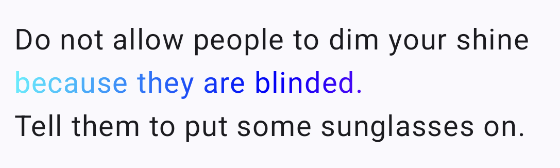
append("Do not allow people to dim your shine\n")
withStyle(
SpanStyle(
brush = Brush.linearGradient(
colors = gradientColors
)
)
) {
append("because they are blinded.")
}
append("\nTell them to put some sunglasses on.")
}
)
}
}
텍스트의 알파값을 수정하려면 SpanStyle의 alpha 매개변수를 쓴다.
val gradientColors = listOf(
    Color.Cyan,
    Color.Blue,
    Color.Magenta
)
val brush = Brush.linearGradient(
    colors = gradientColors
)

@Composable
fun TextTest(
    innerPadding: PaddingValues,
    text: String
) {
    Column(
        modifier = Modifier.fillMaxSize()
            .padding(innerPadding),
        horizontalAlignment = Alignment.CenterHorizontally,
        verticalArrangement = Arrangement.Center
    ) {
        Text(
            text = buildAnnotatedString {
                withStyle(
                    SpanStyle(
                        brush = brush,
                        alpha = .2f
                    )
                ) {
                    append("because they are blinded.")
                }
                append("\n")
                withStyle(
                    SpanStyle(
                        brush = brush,
                        alpha = 1f
                    )
                ) {
                    append("because they are blinded.")
                }
            }
        )
    }
}

텍스트를 특정 방향으로 흘러가게 만드는 Marquee(마키) 효과는 아래처럼 구현할 수 있다.
@Composable
fun TextTest(
    innerPadding: PaddingValues,
    text: String
) {
    Column(
        modifier = Modifier.fillMaxSize()
            .padding(innerPadding),
        horizontalAlignment = Alignment.CenterHorizontally,
        verticalArrangement = Arrangement.Center
    ) {
        Text(
            modifier = Modifier.basicMarquee(), // 추가
            text = text,
            color = Color.Blue,
            style = TextStyle(
                fontSize = 30.sp,
                fontStyle = FontStyle.Italic,
                fontWeight = FontWeight.Bold,
                shadow = Shadow(
                    color = Color.Black,
                    offset = Offset(5.0f, 10.0f),
                    blurRadius = 3f,
                )
            )
        )
    }
}
Marquee 효과를 프리뷰에서 확인하려면 Start interactive mode를 활성화해야 한다.
이 버튼이 어디 있는지 모른다면 아래 사진을 참고한다. 만약 이 버튼을 눌러도 효과가 적용되지 않는다면 새로고침해본다.

참고한 사이트)
https://developer.android.com/develop/ui/compose/text/style-text?hl=ko
텍스트 스타일 지정 | Jetpack Compose | Android Developers
이 페이지는 Cloud Translation API를 통해 번역되었습니다. 텍스트 스타일 지정 컬렉션을 사용해 정리하기 내 환경설정을 기준으로 콘텐츠를 저장하고 분류하세요. Text 컴포저블에는 콘텐츠의 스타
developer.android.com
'Android > Compose' 카테고리의 다른 글
| [Android Compose] 폰트 적용하기 (0) | 2025.08.31 |
|---|---|
| [Android Compose] TextField 사용법 (0) | 2025.08.28 |
| [Android Compose] 드래그로 사진 선택 구현하는 법 (0) | 2025.01.26 |
| [Android Compose] Supabase를 활용한 CRUD 구현 - 2 - (0) | 2025.01.11 |
| [Android Compose] Supabase를 활용한 CRUD 구현 - 1 - (0) | 2025.01.06 |


