
Notice
| 일 | 월 | 화 | 수 | 목 | 금 | 토 |
|---|---|---|---|---|---|---|
| 1 | 2 | 3 | 4 | 5 | 6 | 7 |
| 8 | 9 | 10 | 11 | 12 | 13 | 14 |
| 15 | 16 | 17 | 18 | 19 | 20 | 21 |
| 22 | 23 | 24 | 25 | 26 | 27 | 28 |
| 29 | 30 |
Tags
- jvm 작동 원리
- 스택 자바 코드
- 서비스 쓰레드 차이
- 플러터 설치 2022
- 2022 플러터 안드로이드 스튜디오
- android ar 개발
- 스택 큐 차이
- 안드로이드 유닛 테스트 예시
- ANR이란
- 안드로이드 라이선스
- rxjava hot observable
- 2022 플러터 설치
- 자바 다형성
- android retrofit login
- 안드로이드 os 구조
- Rxjava Observable
- 큐 자바 코드
- 서비스 vs 쓰레드
- 클래스
- 객체
- rxjava cold observable
- rxjava disposable
- jvm이란
- 안드로이드 라이선스 종류
- 안드로이드 레트로핏 사용법
- 안드로이드 유닛테스트란
- 안드로이드 유닛 테스트
- 안드로이드 레트로핏 crud
- 멤버변수
- ar vr 차이
Archives
- Today
- Total
나만을 위한 블로그
[Flutter] AppBar란? AppBar 사용법 본문
728x90
반응형
먼저 AppBar를 설명하는 공식문서부터 먼저 확인한다.
https://api.flutter.dev/flutter/material/AppBar-class.html
AppBar class - material library - Dart API
A Material Design app bar. An app bar consists of a toolbar and potentially other widgets, such as a TabBar and a FlexibleSpaceBar. App bars typically expose one or more common actions with IconButtons which are optionally followed by a PopupMenuButton for
api.flutter.dev
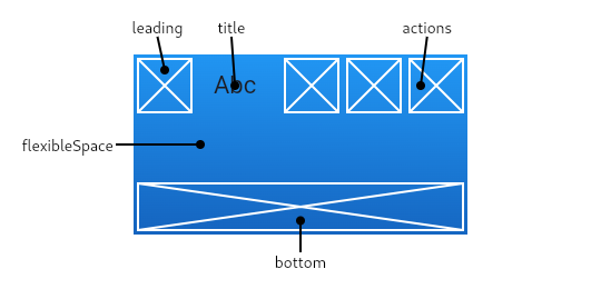
머티리얼 디자인 AppBar(이하 앱 바)다. 앱 바는 툴바(도구 모음), TabBar, FlexibleSpaceBar 같은 다른 위젯으로 구성된다. 앱 바는 일반적으로 하나 이상의 작업을 아이콘 버튼으로 표시하며, 선택적으로 덜 일반적인 작업(오버플로우 메뉴)을 위한 팝업 메뉴 버튼이 뒤따른다. 앱 바는 일반적으로 화면 상단에 고정 높이 위젯으로 앱 바를 배치하는 Scaffold.appBar 프로퍼티에서 사용되며, 이 프로퍼티는 앱 바를 고정 높이로 배치한다...(중략)...앱 바는 툴바, leading, title, action을 bottom 위에 표시한다
일반적으로 bottom은 탭 바에 사용된다. flexibleSpace 위젯이 지정돼 있으면 툴바와 bottom 위젯 뒤에 쌓인다. 아래 다이어그램은 writing 언어가 왼쪽에서 오른쪽일 때 툴바에서 각 슬롯이 표시되는 위치를 보여준다
앱 바는 시스템 UI 침입을 피하기 위해 주변 미디어 쿼리의 패딩을 기반으로 컨텐츠를 삽입한다. 이는 Scaffold.appBar 프로퍼티에서 사용할 때 Scaffold에서 처리한다
앱 바를 애니메이션할 때 Hero 애니메이션에서 흔히 볼 수 있는 것처럼 예기치 않은 미디어 쿼리 변경 때문에 컨텐츠가 갑자기 점프할 수 있다. 앱 바를 미디어 쿼리 위젯으로 감싸고 애니메이션이 부드러워지게 패딩을 조정한다
leading 위젯이 생략됐지만 앱 바가 Drawer가 있는 Scaffold에 있다면 Drawer를 여는 버튼이 삽입된다. 그렇지 않으면 가장 가까운 네비게이터에 이전 경로가 있을 경우 백버튼이 대신 삽입된다. 이 동작은 automaticallyImplyLeading을 false로 설정해서 없앨 수 있다. 이 경우 leading 위젯이 null이면 middle / title 위젯이 늘어나서(stretching) 시작된다
이 내용을 정리하면 아래와 같다.
- 앱 바는 머티리얼 디자인 기반으로 구성된다
- Scaffold에서 앱 바를 사용하면 고정된 높이로 렌더링한다
- 시스템 UI와 겹치지 않게 미디어 쿼리 패딩 기반으로 컨텐츠를 표시한다
아래는 공식문서의 앱 바 예시 코드다.
import 'package:flutter/material.dart';

/// Flutter code sample for [AppBar].

void main() => runApp(const AppBarApp());

class AppBarApp extends StatelessWidget {
  const AppBarApp({super.key});

  @override
  Widget build(BuildContext context) {
    return const MaterialApp(
      home: AppBarExample(),
    );
  }
}

class AppBarExample extends StatelessWidget {
  const AppBarExample({super.key});

  @override
  Widget build(BuildContext context) {
    return Scaffold(
      appBar: AppBar(
        title: const Text('AppBar Demo'),
        actions: <Widget>[
          IconButton(
            icon: const Icon(Icons.add_alert),
            tooltip: 'Show Snackbar',
            onPressed: () {
              ScaffoldMessenger.of(context).showSnackBar(
                  const SnackBar(content: Text('This is a snackbar')));
            },
          ),
          IconButton(
            icon: const Icon(Icons.navigate_next),
            tooltip: 'Go to the next page',
            onPressed: () {
              Navigator.push(context, MaterialPageRoute<void>(
                builder: (BuildContext context) {
                  return Scaffold(
                    appBar: AppBar(
                      title: const Text('Next page'),
                    ),
                    body: const Center(
                      child: Text(
                        'This is the next page',
                        style: TextStyle(fontSize: 24),
                      ),
                    ),
                  );
                },
              ));
            },
          ),
        ],
      ),
      body: const Center(
        child: Text(
          'This is the home page',
          style: TextStyle(fontSize: 24),
        ),
      ),
    );
  }
}
앱 바에 사용된 프로퍼티와 결과를 보면 각 프로퍼티가 아래 역할을 한다고 볼 수 있다.
- title : 위젯을 받아서 앱 바의 제목으로 표시. 문자열만 넣으면 The argument type 'String' can't be assigned to the parameter type 'Widget?' 에러가 발생한다. 때문에 반드시 문자열을 Text 위젯에 넣어서 표시해야 한다
- actions : title 오른쪽에 표시할 위젯을 리스트 형태로 받는다. 지금은 알림, 다음 페이지 아이콘이 표시되지만 필요하면 검색, 설정 등의 아이콘을 추가하고 그에 맞는 화면으로 이동하거나 기능이 실행되게 할 수 있다
이외에도 설정할 수 있는 여러 프로퍼티가 정말 많이 존재한다. 공식문서에서 적용할 수 있는 프로퍼티들과 어떤 역할을 하는지 설명을 본 다음 자기 프로젝트에 맞게 커스텀해서 사용하면 된다.
예를 들어 하단 탭에 아이템을 3개 만들어야 한다면 아래처럼 할 수 있다. 하드코딩한 것임을 참고한다.
import 'package:flutter/material.dart';

/// Flutter code sample for [AppBar].

void main() => runApp(const AppBarApp());

class AppBarApp extends StatelessWidget {
  const AppBarApp({super.key});

  @override
  Widget build(BuildContext context) {
    return MaterialApp(
      home: AppBarExample(),
    );
  }
}

class AppBarExample extends StatefulWidget {
  @override
  State<AppBarExample> createState() => _AppBarExampleState();
}

class _AppBarExampleState extends State<AppBarExample> {
  int _selectedIndex = 0;
  List<Widget> _widgetOptions = [
    Text("Index 0: Home"),
    Text("Index 1: Business"),
    Text("Index 2: School"),
  ];

  void _onItemTapped(int index) {
    setState(() {
      _selectedIndex = index;
    });
  }

  @override
  Widget build(BuildContext context) {
    return Scaffold(
      appBar: AppBar(
        title: const Text('AppBar Demo'),
        actions: <Widget>[
          IconButton(
            icon: const Icon(Icons.add_alert),
            tooltip: 'Show Snackbar',
            onPressed: () {
              ScaffoldMessenger.of(context).showSnackBar(
                  const SnackBar(content: Text('This is a snackbar')));
            },
          ),
          IconButton(
            icon: const Icon(Icons.navigate_next),
            tooltip: 'Go to the next page',
            onPressed: () {
              Navigator.push(context, MaterialPageRoute<void>(
                builder: (BuildContext context) {
                  return Scaffold(
                    appBar: AppBar(
                      title: const Text('Next page'),
                    ),
                    body: const Center(
                      child: Text(
                        'This is the next page',
                        style: TextStyle(fontSize: 24),
                      ),
                    ),
                  );
                },
              ));
            },
          ),
        ],
      ),
      body: Center(
        child: _widgetOptions.elementAtOrNull(_selectedIndex),
      ),
      bottomNavigationBar: BottomNavigationBar(
        items: [
          BottomNavigationBarItem(
            icon: Icon(Icons.home),
            label: 'Home',
          ),
          BottomNavigationBarItem(
            icon: Badge(child: Icon(Icons.business)),
            label: 'Business',
          ),
          BottomNavigationBarItem(
            icon: Icon(Icons.school),
            label: 'School',
          ),
        ],
        currentIndex: _selectedIndex,
        selectedItemColor: Colors.lightBlueAccent,
        onTap: _onItemTapped,
      ),
    );
  }
}

Badge 위젯은 가운데 Business 탭의 빨간 점을 만드는 데 사용한다.
반응형
'Flutter' 카테고리의 다른 글
| [Flutter] Container란? (0) | 2024.08.09 |
|---|---|
| [Flutter] pubspec.yaml이란? (0) | 2024.08.07 |
| [Dart] 반복문 (0) | 2024.08.06 |
| [Flutter] Stateless, Stateful 위젯의 생명주기 (0) | 2024.08.05 |
| [Flutter] Future, async / await를 통한 비동기 처리 방법 (0) | 2024.07.24 |
'Flutter' Related Articles
more

Comments